Elements of Art
|
Formal Qualities of Art
While it is important to examine any given work of art in its historical context in order to arrive at an understanding of its meaning, the basic visual components of a work of art also need consideration. These include line, shape, form, space, color, and texture, among other things. Formal analysis requires careful observation and description, often using terms unique to the field of art. |
|
|
|
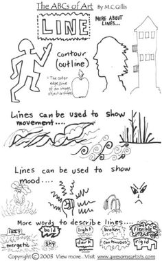
Line
Line is the most basic of art elements. Any kind of mark-making tool—a finger, pencil, paint, etc.—can be used to create a line on a surface. The strict definition of a line is the path of a point moving through space. But beyond this technical definition, lines have a variety of characteristics such as length, width, and direction. Lines may appear hard or soft, bold or blurred, constant or variable in width. Sometimes lines are not solid but consist of a series of dots or marks that only appear to create a line. Think of prints in the sand or snow that imply the path of a person or animal. Sometimes we see the edges of objects as lines. The corners of rooms, the edges of doors, and the line where two colors meet all provide examples of how edges may be seen as lines.
Artists use lines to express ideas or feelings visually. Horizontal and vertical lines can create a stable feeling, and vertical lines cause the eye to move upward. Because of this, medieval churches were created with very high arched ceilings, designed to raise people’s eyes upward toward heaven to promote a feeling of spiritual awe. Horizontal lines, such as the line of the horizon, suggest a feeling of peace and tranquility while curving and jagged lines create a sense of activity. Though the use of lines is perhaps most essential and noticeable in drawing and some kinds of printmaking, all artists use line in their artwork in some way.
|
|
|
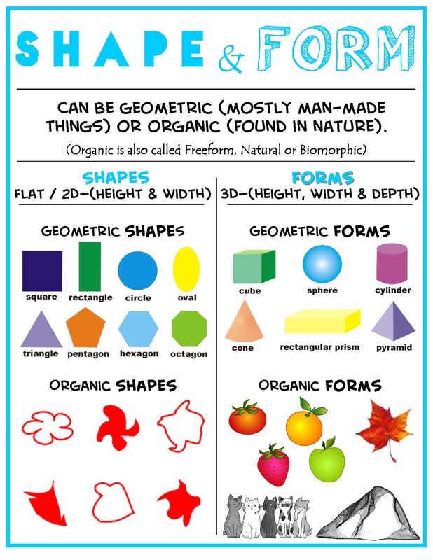
Shape and Form
Shape and form are two elements of art that are closely related to one another. Shape describes an object’s two-dimensional area, while an object’s form is three-dimensional and has length, width, and depth. For example, a square is a shape, but a cube is a form. Both a real apple and an apple made out of clay are forms, but an apple drawn on paper is a shape. When creating art with two-dimensions, artists often try to create the illusion of form by adding shading, perspective, texture, and other techniques.
Some shapes and forms may be categorized as geometric, such as circles/spheres and squares/cubes. These geometric shapes and forms are precise and regular. Other shapes and forms are considered organic, because living things tend to be flexible and irregular in shape or form. A geometric shape or form can convey a sense of order and stability, while organic shapes and forms tend to express movement and rhythm.
Space is an element of art related to the organization of objects and the areas around them. The objects, shapes, or forms in an artwork make up its positive space. Sometimes these objects, shapes, or forms may be called the figure in a work of art. On the other hand, the area around these objects, shapes, or forms is referred to as negative space. In three-dimensional works of art, like architecture and sculpture, negative space is the area within the open spaces of the artwork or in the area closely surrounding it.
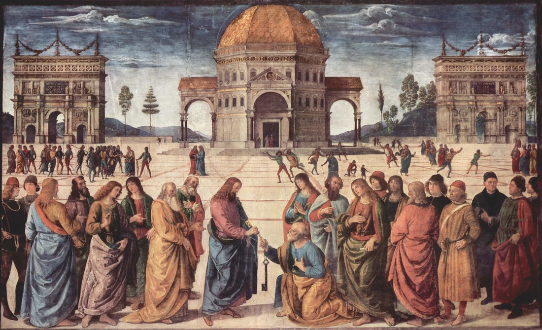
Pietro Perugino’s usage of perspective in this fresco at the Sistine Chapel (1481-82) helped bring the Renaissance to Rome
|
|
Perspective
When artwork is two-dimensional, artists often use a group of techniques that are called perspective. Artists utilize perspective when they want to provide the illusion of depth. For example, darker or lighter colors can be added to shade or highlight the edges of shapes in a work of art. Artists do this in an attempt to copy how light gives three-dimensional objects a sense of volume and space. An artist can also create a sense of depth by placing objects lower on the picture to make them appear closer, and other objects higher to make them appear farther away. Choosing certain sizes and placement of the objects in an artwork can also create a sense of perspective. Larger objects will appear closer to the viewer than smaller objects, and objects that overlap others will appear to be closer than those underneath. Artists can even create depth by giving detail to objects they want to appear closer, because in real life, we see closer objects in greater detail than those that are farther away.
When artwork is two-dimensional, artists often use a group of techniques that are called perspective. Artists utilize perspective when they want to provide the illusion of depth. For example, darker or lighter colors can be added to shade or highlight the edges of shapes in a work of art. Artists do this in an attempt to copy how light gives three-dimensional objects a sense of volume and space. An artist can also create a sense of depth by placing objects lower on the picture to make them appear closer, and other objects higher to make them appear farther away. Choosing certain sizes and placement of the objects in an artwork can also create a sense of perspective. Larger objects will appear closer to the viewer than smaller objects, and objects that overlap others will appear to be closer than those underneath. Artists can even create depth by giving detail to objects they want to appear closer, because in real life, we see closer objects in greater detail than those that are farther away.
|
|
|
Color
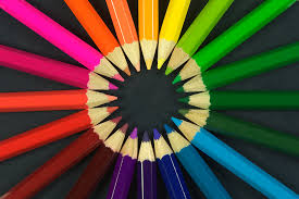
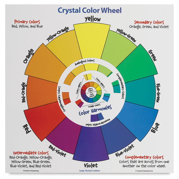
Color is a central element in art, and is more complex than one might think. When speaking of color, the hue is simply the name of the color. There are three primary colors of pigment—red, blue, and yellow—from which all other pigment colors are produced. Secondary colors are formed from the mixture of two primary colors: red and yellow make orange; yellow and blue make green; blue and red make violet. There are six tertiary colors, which are made when a secondary color is mixed with one of its primary colors: red and violet make red-violet; violet and blue make violet-blue; blue and green make blue-green; green and yellow make yellow-green; yellow and orange make yellow-orange; orange and red make red-orange. The organization of these hues into a circular display is known as a color wheel, which can be useful when mixing hues.
One quality all colors possess is intensity, which refers to the brightness or purity of a color. Because the unmixed primary colors of red, yellow, and blue are pure in color, they are the most intense colors. Whenever pure colors are mixed with neutrals or other hues, they become less intense. If complementary colors, such as red and green, are mixed using equal parts, the result will be a dull, muddy brown tone. If artists want to mix a darker or lighter shade of a color, they can add black or white, which are called neutrals. Adding black to a hue will darken it, while adding white will lighten it. By mixing different amounts of black and white together, artists can also create a wide variety of grays. When talking about the lightness or darkness of a hue or of gray in an artwork, this is a discussion of value. An artwork’s value may be mostly dark, mostly light, or may vary from dark to light. Artists often use value to set the mood or tone of a work of art.
Certain color families can even be used to create space and movement in a piece. When discussing art and color, we often speak of warm colors and cool colors. Warm colors include red, orange, and yellow and are referred to as such because we associate them with the warmth of the sun, the heat of a roaring fire, or the dry grass of a late summer day. Cool colors—green, blue, and violet—remind us of cool forests, mountain lakes, and snow. Artists often use warm and cool colors to create space in artworks because warm colors seem to advance toward the viewer while cool colors appear to recede. When an artist uses contrasting warm and cool colors, she can create a sense of movement in her artwork.
|
|
|
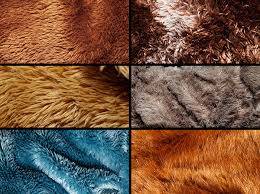
Texture
Texture refers to how things feel or how we think they would feel if touched. From a young age we explore the surfaces of things and store away these tactile experiences in our memory. When we see new objects or artworks, we call upon our previous experiences to determine the quality of the surface texture. In the context of art, we make reference to two kinds of texture: actual and visual. Some artists use actual textures in their art. For example, a ceramic artist may create an actual texture on the surface of a pot or plate. In collages or masks, artists may use yarn, rope, shiny paper, shells, and other materials to create actual textural effects. Artists who work in three-dimensional media can utilize the textural qualities of their chosen material whether it is stone, wood, metal, or some other substance.
Artists who work in two-dimensional media create visual texture—an illusion of a textured surface— in their artwork. For example, an artist may wish to imitate the actual texture of a straw hat, a glass vase, or an orange. Textures may be created by using patterns of lines or shapes that suggest texture. An artist can use the contrast of light and dark on a surface to create a texture that appears rough. Conversely, the absence of such a contrast will evoke a smooth texture. Shiny surfaces appear to reflect light while matte surfaces appear soft and dull. In addition to using the aforementioned techniques to create visual texture, painters can create actual texture with their brushstrokes.
